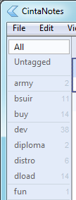
Show tag usage counters on sidebar
(http://cintanotes.com/forum/viewtopic.php?f=4&t=170)
Answer


Why in tooltips? Yes, it's less visual noise, but less accessible. And would these counters would really make so much noise?
Consider this option. Tag counter usage counters appear in the sidebar, in the tag cells, vertically aligned to the right. Font size is same as tag name font size - 8 (doubt less is possible). Font color is less contrast than tag name font color. Color might be the same as used in selected counter in the top right. It could look like this (maybe with little more contrast.

Also, if it's possible to make counters font less than tag name font, counter numbers should be horizontally aligned so that their vertical centers would be same high as tag name centers.

I completely agree with burrum. I think tag counts would be very annoying in tool tips, but shown in the interface (as per his mockup) would be extremely useful. The lack of this feature is really the only thing left keeping me from switching away from my old evernote3.1 install (which I am eager to switch from)


Sorry, but I don't agree because I hope we will get colours for a different feature (and too many colours would mess up the UI) -> http://roadmap.cintanotes.com/topic/3368-different-colors-for-different-note-categories/
Customer support service by UserEcho

