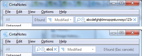
Move search bar to the right
Move search bar to the right. I use CN around a year, but still
confused
every time with place of search bar, every time I click to "sort by bar" first, when I want to find something. Because all in all other software (browser, Explorer, OneNote, uTorrent and many many other) search bar placed at top right corner. Also I fully resize CN window to get view like a paper notepad in the hand (habit), in this form he looks like a good KISS software. But in this form, the search bar show only 3 letter. I really don't understand why sort bar still so long, because even the most long word "Modified" have 30% white space after it. Look at my mokup, maybe it's more productive and matches HIG of any platforms.
Ответ


Сервис поддержки клиентов работает на платформе UserEcho


