Your comments
The feature looks pointless to me. But if it gets popular, here's a possible implementation.
Check out tagging mechanics in CASEapps Tags application for Mac in it's screencast here:
Probably it could be modified for multi-term tags. For example, user types "three word tag", then hits a special key (like ';'), and the words are grouped into a tag, which is renderred in an intuitive single block.
I hope it's obvious I'm not promoting the product, it's just an example of a good implementation.
In the forum it is suggested to indicate the level of tag "relevance" by it's order in tag field.
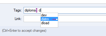
Another possible approach is to introduce a "level of relevance" of a tag to a given note. It could be simple 3 or 5 grade level, or in the worst case, any integer number. In case with 3 grade relevancy, it could look like this:

And the fast keyboard input would work as follows:
1. Type some letters to spawn autocomplete window
2. Use Up/Down arrows to select a tag
3. Use Left/Right arrows to select relevancy from 1 to 3 points
4. Press Enter to confirm
5. Relevancy points are indicated next to the tag
In case with any integer number, tag input could look like this: "dog*9 pet*6 animal*3" (using an example by faus in forum thread).
This is a fancy feature, however, I don't see any point implementing it (at least now), because:
1. It seems to introduce more complexity than benefit. I cannot imagine how this feature enhances user experience.
2. Planned feature "Tag grouping/hierarchy" [1] might be somwhere near this one.
[1] http://roadmap.cintanotes.com/topic/3182-tag-groupinghierarchy/
So this should be possible to be undone as well.
http://roadmap.cintanotes.com/feedback/3369-drag-and-drop-notes-to-tags/
since we tag notes, not note tags :)
I suggest the following requirements for this feature:
1. It should be optional. User can edit notes either in-place, or in separate editor.
2. In-place editing is enabled by default and activated via double click, since double click should activate default editing mode.
3. Note's context menu has "Open in editor" item.
4. It should have a hotkey (F2 feels native for Windows), in case it gets disabled.
5. Notes are in read-only mode by default. Ability to switch to "Always use editor mode" should be discussed in another thread.
6. A toolbar with Tags, Link and "Save" and "Discard" buttons should appear in editing mode (and disappear in read mode).
7. If "rich editing" [1] gets implemented, it's toolbar should also appear in editing mode.
Optional sub-features:
1. Fade other notes, when current one is edited.
2. We could get rid of "Tags" field, by mergin it with note's tag bar (the one under the Title). So tags could be entered there inline, allowing to create new tags right there.
3. Tagging experience could be enhanced by "tags drag-n-drop" [2] feature. User could drag tags from sidebar onto edited note.
4. Semantics of ctrl- and shift-clicking tags on the sidebar could change in in-place editing mode to add or remove tags to the currently edited note.
Implementing sub-features 3 and 4 would cover the "tag picker control" [3] functionlaity. However, it would still be needed for editing notes in separate editor.
References
[1] "rich editing"
http://roadmap.cintanotes.com/feedback/3174-basic-text-formatting-support-bold-italics-lists-monospace/
[2] "tag drag-n-drop"
http://roadmap.cintanotes.com/feedback/3370-drag-and-drop-tags-onto-notes/
[3] "tag picker control
http://roadmap.cintanotes.com/feedback/3181-tag-picker-control/
As an alternative, sidebar width should be fit the longest tag. Um, I like this even more than mouse-resize :)
http://img72.imageshack.us/img72/8929/userechook.png
And unbanned addthis in Opera.
Thanks.
Customer support service by UserEcho


Every text rendering program has its own text-selection context menu. Hacking all of them to add "Add CintaNotes note" menu item sounds effective, but way too intrusive :)
(Configurable) Ctrl+F12 global hotkey doesn't look way less convenient than menu item, does it?