Your comments
Mark, you're welcome. You need to close cintanotes before editing the file. That is open the main window and execute file\exit. Change the setting and start cintanotes.exe again.
14 years ago
Mark, it's there. You can change the (imo: strange) default in the configuration file. Edit the file "C:\Users\<username>\AppData\Roaming\CintaNotes\cintanotes.settings" and edit/add the following line "editor.focus.title = 1". kind regards, Thomas
The reason i came up with TABs is because other users do have concerns that one field more, would clutter the UI. Also tabs do have the advantage, that they can easily be turned off (made invisible), when not needed. For example, users that might not want to use attachements could turn off the tab and keep focused on their perspective.
Imo, the remarks field needs to be on the first tab! Why? Because it contains valuable information itself. Infos that i want to read right away, without changing the tab. The links on the other side do not contain information. They point to information somewhere else. Thus i think they can be in a different tab. If you want to read the links content you can press F7 and open (all) links in the browser. 99.5% of my remarks content fits into a single line. Since others might have different needs i think it is the remarks field that can start with a single line and auto-expand as needed.
Please check the discussion and the mockups here.
OK, let's do that.
I don't insist on a pull model. The other request there is similar, but not exactly. The clipping hotkey creates a new note each time it is used. I want to collect a couple of URLs into one single note. I want the URLs collected in the notes text, not the link field. I want to collect the URLs to an existing and opened note or to a new note depending on the situation. Also with each URL i want to copy the title without having to select it first. This all could be done with a push model too. No problem. Merging URLs from different notes is an unnecessary job. That's like merging the URLs from the browser in the first place.
The three posts i try to combine with this request count 14+4+8 together, which adds up to a total of 26 votes. Even if you consider them not unique, the least would be 14 votes for your Annotations request.
As an alternative to the discussion here and the "note to note" discussion i have created a mockup-gui that might satisfy all needs.
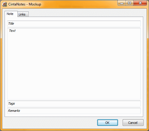
The main tab is similar to the existing design with the difference of having a "remarks" field instead of the "link" field.
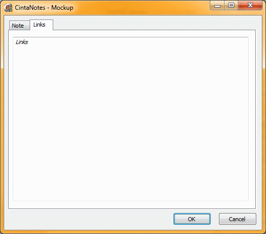
The tab "links" offers a big edit field for adding multiple links each saved in its own line, separated by CR+LF.
Compared to the current design the "only" change is the visibility of the two tabs. This design satisfies peoples request not to clutter the UI while at the same timer offers new possibilities. Other tabs might come handy in the future for adding other features. Also it could be possible to allow the user to set the visibilty of tabs. That is all tabs except the first (main) tab can be turned off. When one tab is left only (the main tab) it could be even optimized to don't show a tab row at all. In which case the design would be absolutely identically to the current design.
Instead of labels i used a design approach taken from iOS. As long as the edit field is empty show the label inside the edit field in italic font. As soon as the user enters text, the label-text gets removed. This allows for an even cleaner design, saving space and still allows new users to understand the gui right away.
The main tab is similar to the existing design with the difference of having a "remarks" field instead of the "link" field.
The tab "links" offers a big edit field for adding multiple links each saved in its own line, separated by CR+LF.
Compared to the current design the "only" change is the visibility of the two tabs. This design satisfies peoples request not to clutter the UI while at the same timer offers new possibilities. Other tabs might come handy in the future for adding other features. Also it could be possible to allow the user to set the visibilty of tabs. That is all tabs except the first (main) tab can be turned off. When one tab is left only (the main tab) it could be even optimized to don't show a tab row at all. In which case the design would be absolutely identically to the current design.
Instead of labels i used a design approach taken from iOS. As long as the edit field is empty show the label inside the edit field in italic font. As soon as the user enters text, the label-text gets removed. This allows for an even cleaner design, saving space and still allows new users to understand the gui right away.
It is similar, but not the same. This request is for pulling infos, the other is pushing infos. Both have there advantages. As i have commented the other request: if it would be smart enough, to detect a browser and automatically copy the URL it would help a lot. But with this request i don't even need to select text! CN should copy the window/page title and the URL in one step. That is even easier than having the need to select text first.
Customer support service by UserEcho